For this multimedia artist's portfolio website, I started with a bold, colorful direction. Since his work leans heavily on doodles and sketches, I built the landing experience as an "artist's table," sketches, notes, and photos scattered across a desk, so scrolling in felt like peeking straight into his sketchbook.
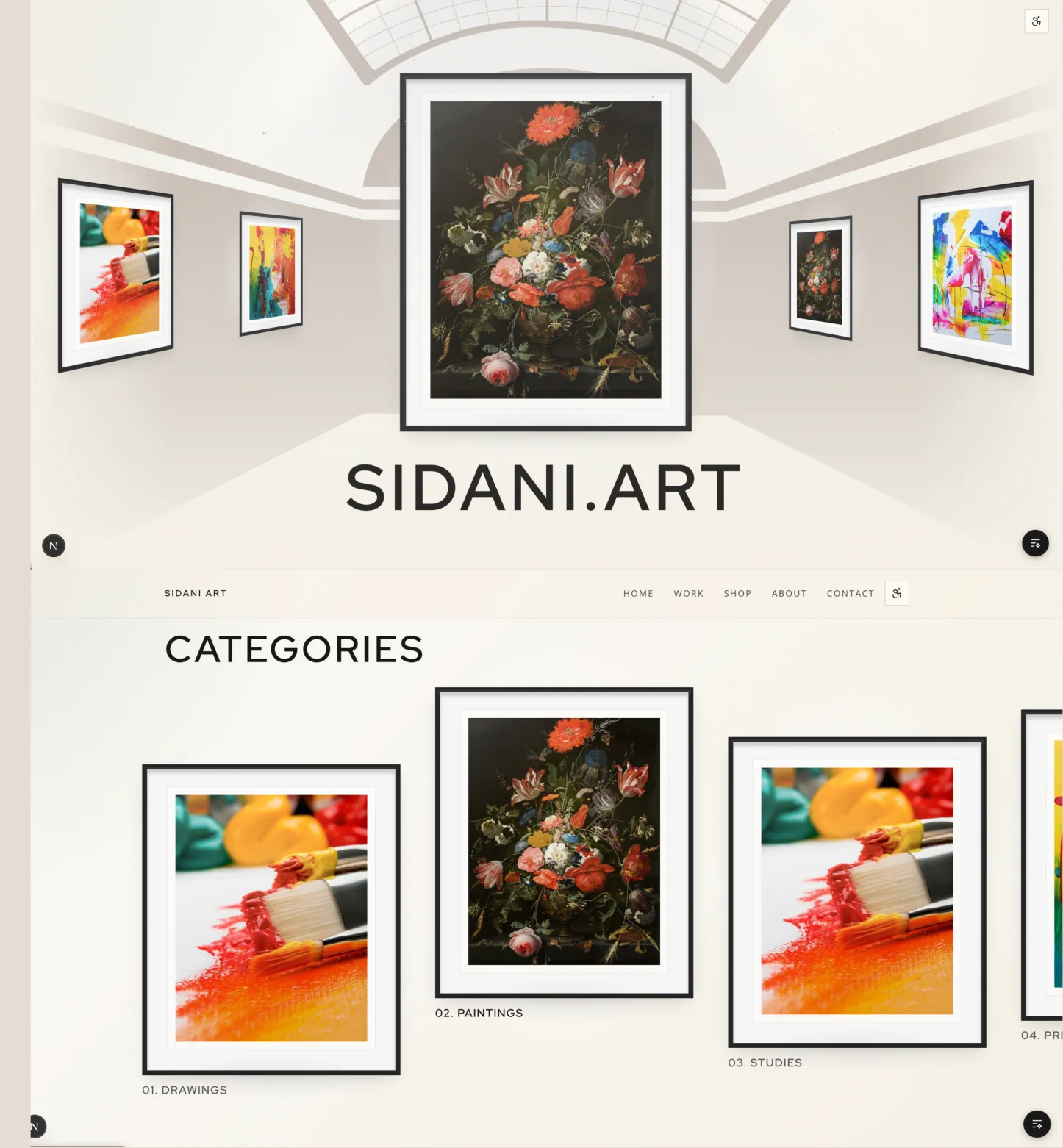
He wanted something more refined instead, closer to a gallery, so I pivoted the whole direction: a minimal, gallery-style layout built from his references, framed pieces on clean walls, generous whitespace, and micro-animations layered throughout to keep it from feeling static.
The final site has a gallery-led homepage that puts the work first, a categorised browse structure across drawings, paintings, studies and prints, and a scrapbook-styled About page built to feel handmade rather than corporate.